


Introducing Fileside 2
It’s done. It took a bit longer than I’d hoped but Fileside 2 is done. It represents an almost complete rewrite and features a new thumbnail grid, a completely reworked layout management system, non-blocking file transfers, tons of new settings and much more.
Big thanks to all the beta testers in the Discord group and a special shoutout to OliOS/2, VerglasOnSilt, Jarred B, Panu A and Ivar Bonde for providing a constant stream of feedback and bug reports during the last three months.
For a basic change log with just the nitty-gritty details, see the release notes. Stay put for a more in-depth blog-style run-through of what’s new and the thinking behind it.
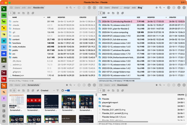
Thumbnail view
Fileside 1 tried to get away with just a table listings view for the longest time. I initially reasoned that the inline preview pane would handle the job of peeking into files just fine. But the cries from a subset of users were loud and clear: “We want a thumbnail grid.”
Eventually I had to concede that it really would come in handy at times. Particularly for folders full of photos all with names like PXL_20210914_105409994.jpg. So here we are, Fileside now has a grid view.
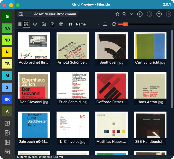
On Mac, native support for generating thumbnails from a large variety of file types is very good. We get not only images and videos, but also PDFs, office documents, e-books, text files, MP3 album art and more. On Windows, not so much. There we get images, folders, album art and not much else.
When no thumbnail preview is available, we fall back to large icons. Subfolders get a size overlay when they have size data calculated.
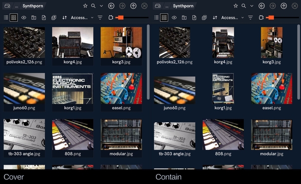
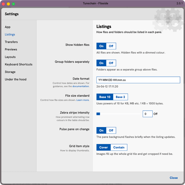
Thumbnails can be displayed in two different ways, controlled via an option in the Settings dialog:
- Cover will grow the image to fill out its tile, cropping off bits if needed. This one makes the grid look nice and tidy.
- Contain will always display the whole image, resulting in irregularly-shaped tiles for images that are not perfectly square already.
The view mode is selected with the toggle top left. The slider top right is for controlling thumbnail size per pane, and there’s a dropdown for sorting.
As an added bonus, the table view now also has a (fairly useless I must admit) thumbnail column available.
Loading many large image and video files can take a fair bit of time, especially when viewing folders over a network connection. Therefore a caching layer had to be added to make this view performant; rendered thumbnails get cached as files in the application data directory. This cache can be cleared through the new Storage section in Settings if needed. The settings also have a couple of parameters related to grid view performance to tweak if you feel like rolling your sleeves up.
Layout management
The layout management system in version 1 was never that well thought-through. A saved layout acted as a jumping-off point only, that when loaded was copied into a hidden layout slot behind the scenes. This slot could be saved back into the layout it came from, or it could be copied into a new named layout slot by clicking the standalone save button. Loading another layout would silently discard any changes made to the active layout, and overwrite the active slot.
Because of this, there was no concept of a currently loaded layout; there was just a last used jump-off point plus whatever happened to be in the active slot.
Dirty talk
Version 2 solves this by introducing the concept of clean and dirty states for each layout. The clean version represents the last saved state, and the dirty version represents the last edited state as you currently see it on the screen. This dirty state is remembered per layout (and per window too if you have several windows open).
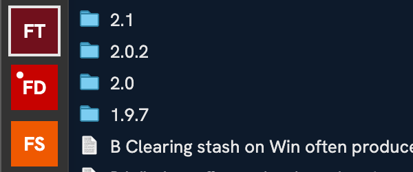
Once you modify a layout, and its state deviates meaningfully from the last saved state, a small dot will appear in the corner of the layout’s button indicating that it’s dirty. This dirty state will always be remembered even if you temporarily jump to a different layout, so you can quickly hop between layouts without losing where you were.
If you want to go back to the clean state, there’s a Revert button for that. And if you want to store your changes as a new layout, use Save As (a.k.a. duplicate, which can also be achieved by clicking the + New Layout button which will be initialised from the current state).

This is arguably a more standard UX pattern than how v1 worked. It’s consistent with how open tabs work in many text editors or IDEs like Visual Studio Code. It feels both more versatile and consistent compared to before.
However, it can be a bit jarring if you got used to the v1 behaviour (as the beta testing showed), where you could always just get back to the saved state by clicking one of the layout buttons. To help bridge this, there are several methods to load the clean layout in one go:
- Click the Revert button
- Double-click the layout button
- Alt/Option-click the layout button
- Use the Cmd/Ctrl+B keyboard shortcut
At the other extreme, you now also have the option to always automatically save each layout when changed, via the new Autosave layouts option. With this on, you’ll never see any dirty layouts at all.
Other bits and pieces
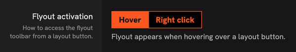
The flyouts always flaring up when hovering a layout button can be distracting, especially now that each layout’s toolbar is longer. To that end, there’s a new option Flyout activation under Layouts in Settings, where you can make it activate on right-click instead.
The sidebar can now also be expanded by dragging its right edge out to reveal full names and toolbars without needing to activate the flyout.
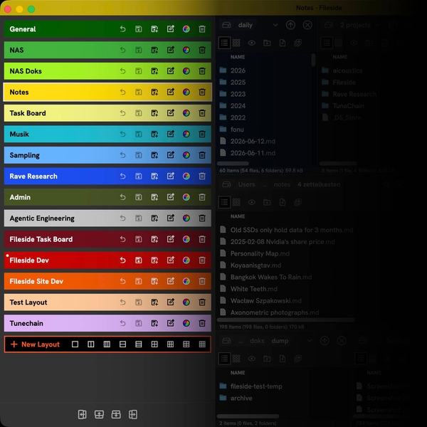
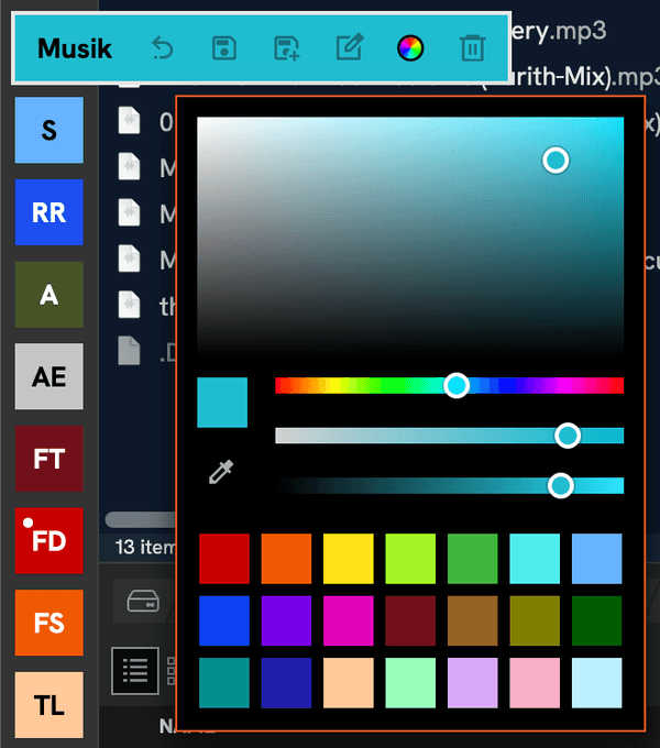
It’s finally possible to assign any custom colour to a layout via the colour picker on its toolbar, and also have the currently active layout tint the window’s title bar. The tint intensity can be controlled under App in Settings.
The + New Layout flyout comes with a bunch of presets for common setups, where you can grab a 1x1, 1x2, 1x3, 2x2, 3x1, 2x2, 2x3, 3x2 or 3x3 grid.

The buttons for adding panes within a layout are now at the bottom of the layout bar, and support all cardinal directions.
Panes
Layouts, of course, would be perfectly useless if it weren’t for the panes they hold - the most important players in day-to-day file management. Panes have moved in a slightly more traditional direction in v2, with each sporting a good old toolbar instead of the sometimes problematic floating overlay.
Any action pertaining to the pane itself now lives inside the pane’s boundary, while actions pertaining to the layout or the app live outside.
The favourites and search features have been made a little easier to find through two new toggles immediately right of the path navigator. Thereafter come new buttons for going back and forward in the pane’s history of recent locations. This addition means we can now also finally support navigating with extended mouse buttons 4 and 5, that are available on some mice.
The pane toolbar lives just underneath and adapts based on whether a pane is in table or grid view.
As before, each layout has an active pane, which is where all keyboard shortcuts affecting files get routed. Multiple users reported they had trouble visually distinguishing this at a glance, so it’s had some tweaks to make it light up more prominently.
If a pane in table view has more width available to it than its columns need, the Name column now automatically grows to fill it.
Transfers
Another frequent request has been to make long file copying operations happen in the background instead of blocking the app window in which they were initiated. So each app window in v2 hands over to a central dispatcher, which runs the transfer for it.
By default, this takes place in a separate worker process that gets spawned the first time you start any file system operation. The worker then stays alive for faster serving of subsequent requests. The use of the worker process, and whether it should stay alive, can be toggled under Settings section Under the hood.
Multiple transfers can be started simultaneously, and each will get its own worker and progress window.This might not be the best idea though as it can overwhelm the hard drive with lots of unrelated reads and writes.
Settings
The settings dialog has had a much needed renovation, and is now a much airier and friendlier place with more guidance and explanations of each setting’s effect. The options surfaced here have also been substantially expanded.
Noteworthy new settings not covered in the preceding sections are:
- App > Zoom level: Increase or decrease the size of text and icons to suit your acuity of vision.
- Transfers > Drop action: Set a default action instead of always getting the Copy/Cut/Link popup on drop.
- Listings > Zebra stripe intensity: Dial in a background tint for alternating rows in table view.
- Listings > Date format: Customise how dates are displayed in listings.
- Listings > File size standard: Control how file sizes in bytes are calculated.
- Listings > Pulse pane on change: Get a subtle indication when something is updating entries in a folder.
- Under the hood > Terminal path: Specify which terminal application to launch.
The keyboard shortcuts section now features a keystroke recorder, instead of the error-prone manual typing of shortcut strings in v1.
In the new Storage section, you can see at a glance how much space the various caches take up, and clear them.
Loading of config/settings files from disk is now more robust too. If anything goes wrong when loading a config file, say because you made some manual edits and a mistake slipped through, it will save a copy of the bad file with an extension like .failedToValidate instead of letting the app load it up and possibly crash.
Menus
A major version bump also seemed like a good opportunity to overhaul the application menu bar. It now mirrors the hierarchical structure of the type of objects the app deals with.
- Fileside (or just App on Windows): Actions related to the app as a whole.
- Edit: Classic editing actions like undo/redo and copy/cut/paste.
- Entry: Anything specific to a file or a folder (i.e. an entry) in a listing. These generally require an entry to be selected to have any effect.
- Pane: Actions pertaining to the active pane as a whole.
- Layout: Actions for managing the layout(s). (Who’d have thought.)
Entry context menus have been enriched, and now feature a Pane submenu with all the actions pertaining to the pane rather than the selected entry.
Windows
The implementation to support multiple app windows was a bit of a bolted-on afterthought in Fileside 1, and it showed up through several edge-casey state synchronisation bugs. Now there’s a whole new window management system in place where each window has its state tracked, persisted and restored separately.
The list of available layouts is global, and will be instantly synced between windows. However, each window can have its own dirty version of each layout, to support making different modifications to the same layout across multiple open windows. These dirty states are also persisted to disk so you won’t lose them after a restart.
Migrating from version 1
If you already have Fileside 1 installed, you’ll be offered to migrate your existing layouts and settings when Fileside 2 first starts up. For this to work, make sure your existing install is on the latest 1.9.6 version before starting.
Editions
If you’re convinced enough by the above to want to own your own copy of Fileside 2, you now have a choice of two editions.
The Duo edition gets you version 2 and includes all its subsequent updates up to but not including 3.0. This is identical to the single option that was available for buying Fileside 1.
The big bang Futuro edition is for those who never want to pay anything again and gets you every new major Fileside version in all eternity, for as long as it exists.
Existing Fileside 1 users get 50% off on upgrades. Just use the Upgrade link under the Buy button.
Closing words
The work is still far from done, as I was just reminded of in an email from a new buyer who asked “how do I drag the panes around inside a layout?“. That, and plenty of other features and improvements that didn’t make it into 2.0 are still in the backlog. I’m looking forward to being able to move on to those in the coming months. Until then, happy filing!
Oh, and zero AI features were added. Just in case you were wondering.


